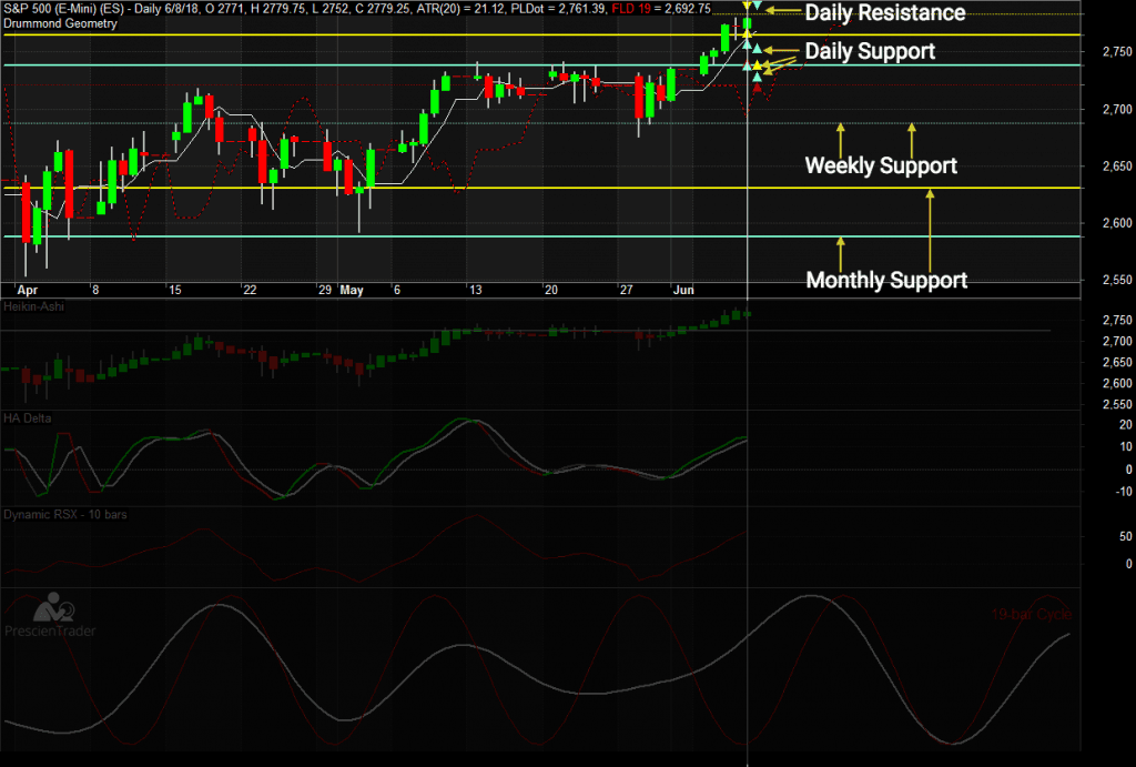
Drummond Geometry is an extremely powerful trading methodology developed over many years by the legendary Canadian trader, Charles Drummond. Mastering all the aspects of Drummond Geometry requires years of study and practice. We’ve studied this methodology extensively and we think it provides the most accurate support/resistance analysis of any methodology we’ve seen. The Drummond support/resistance lines are derived from the actual geometry of the price chart, hence the name. Time and time again, we’ve seen price cut right through a conventional support/resistance zone and stop almost exactly on a Drummond line. This can enhance your trading results by showing you exactly where price may go. As with any trading technique, it doesn’t always work, but it’s often almost spookily accurate.
On our charts, we draw the Drummond Geometry lines in the top pane, where the price bars appear. The last bar displays support/resistance areas directly on the bar, in the form of upward or downward pointing triangles. These triangles represent the support and resistance for the current timeframe. The triangles also appear in the area where the next bar will form, so you know the expected support and resistance one bar in advance. For example, if you’re viewing a daily chart, the triangles represent daily support and resistance. The different colors represent different categories of Drummond lines. The explanation of the categories is beyond the scope of this article, plus we’re prohibited by our non-disclosure agreement from discussing these details outside the Drummond Geometry community.
In addition to the triangles, we also display the higher time period (HTP) support/resistance zones as horizontal lines that cover the entire width of the chart. The zones from the first higher time period are displayed as thin horizontal lines and the second higher time period zones are displayed as thicker horizontal lines.
- On the daily chart, the lines represent the weekly and monthly zones.
- On the weekly chart, the lines represent the monthly and quarterly zones.
- On the monthly chart, the lines represent the quarterly and yearly zones.
The HTP lines will shift up or down after each new HTP bar. For example, when a new week starts, the weekly lines on the daily chart will shift up or down from the prior week. Since we draw them as straight lines, they’re only accurate for future bars; they do NOT necessarily represent support/resistance for past bars. We draw them as straight lines for the sake of readability. If we plotted the actual lines for past bars, with all the shifting around, the chart would turn into a cluttered mess. There are many lines and it ends up looking like spaghetti. As with the Prescient Line, you can view the past HTP support/resistance zones on our historical charts, which are available for the past 90-days.
In terms of importance, the higher the time period, the more significant its support/resistance zones are. For example, daily support will break more easily than weekly support, which will break more easily than monthly support. When multiple zones appear in a cluster, that implies an area of strong support or resistance.

